A modest fashion label selling coordinated sets, with a product people already came back for and no brand around it. There was a shoot and a season. The positioning, the voice, the visual system, and the plan for how a collection should arrive were open.
The language was the first problem. Elevated. Crafted. Comfort. The same words every label online is using, and words that describe loungewear, travel clothes, something to pull on around the house. The founder had bought the company, and what she was designing had moved somewhere else entirely. The language had to move with it.
So we took them out and said what the label actually solves. Coordinated silhouettes. A matching top and skirt that looks considered and current, for a woman who has spent years assembling that look one piece at a time and rarely finding it in one place. The tagline changed with the rest.
Then the fabric. The founder kept saying the fabric is heavenly, and customers kept coming back for the way it felt: soft and breathable, with enough structure to hold a shape and fall the way it should. It had no name. So we named it. OffCloud, cleared through a trademark search before anyone said it out loud, and written into the brand as a named material, so future fabrics can join it under the same system as the range grows.
The label runs on limited collections and seasonal drops, so the brand was built for the version of the company that has run ten of them, rather than the one that has run its first.
The launch became a serialized publication, using the newspaper that already existed as a prop in the shoot. A gazette. Volume One, across two chapters and five editions. The register is editorial rather than retail. The copy narrates instead of announcing. A set arrives as an edition rather than a drop. The captions read like a masthead voice, so the brand sounds the same describing a jacket as it does describing a season.
The repositioning is visible in about a second, before anyone has read a word. The copy, the carousels, the story frames, the type sitting on the profile, the reels cut like film with the audio chosen before the edit began. Every surface changed at once, which is the only way a repositioning is ever actually felt.
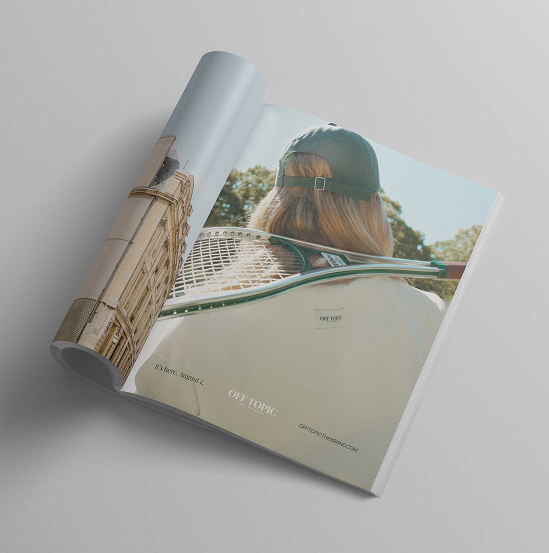
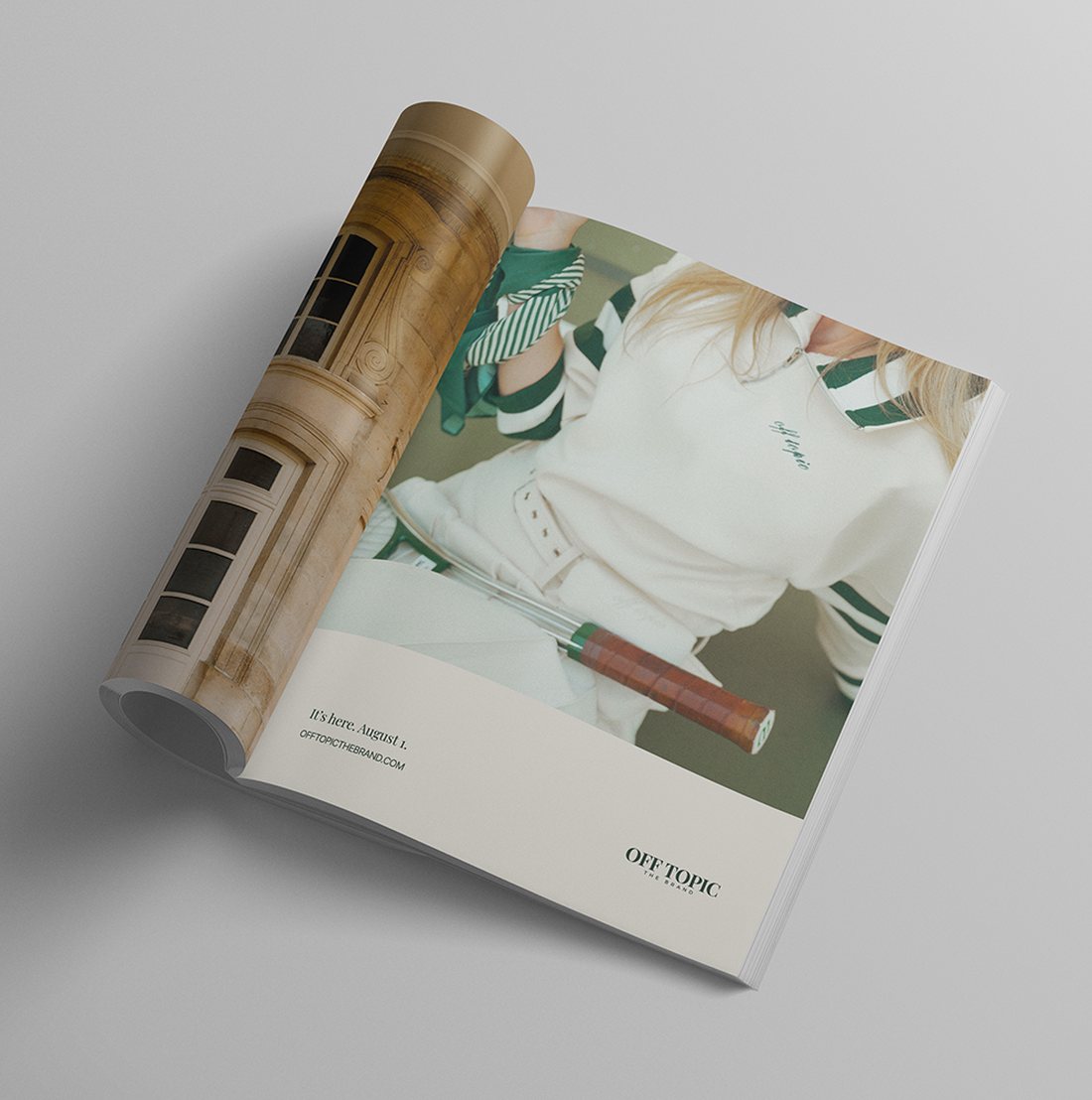
Then we made it. Nine films sequenced as a series, produced on set in New York, plus a wide cut for the website hero. Two magazine ads, concepted, art directed, written, and matched to the publications they should run in. A carousel system her team can repeat, six highlight covers named for the sets themselves rather than Shop and About, a profile bio written as a masthead line, and a day-by-day launch calendar sitting in a content database she runs without us.
That voice is live on the site now. A New Chapter. Coordinated sets, cut in OffCloud, New York. Volume I out now, a brand told in volumes. Down the page, the fabric gets one line: it moves like ponte and breathes like cotton.
Six highlight covers, each named for a set
Two ads, concepted, art directed and written as a pair, so a first impression of the brand arrives the same way in print as it does on a feed.
Three of the nine films, in the order they went out
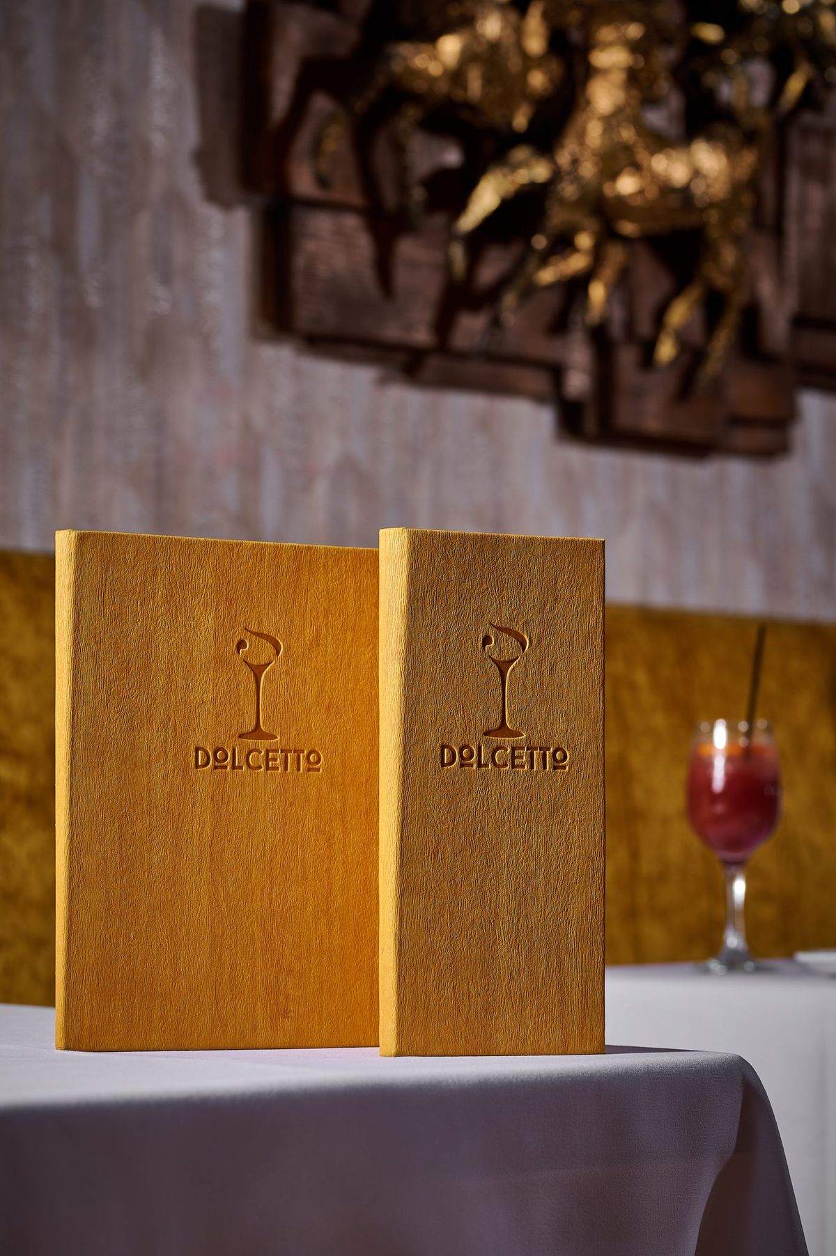
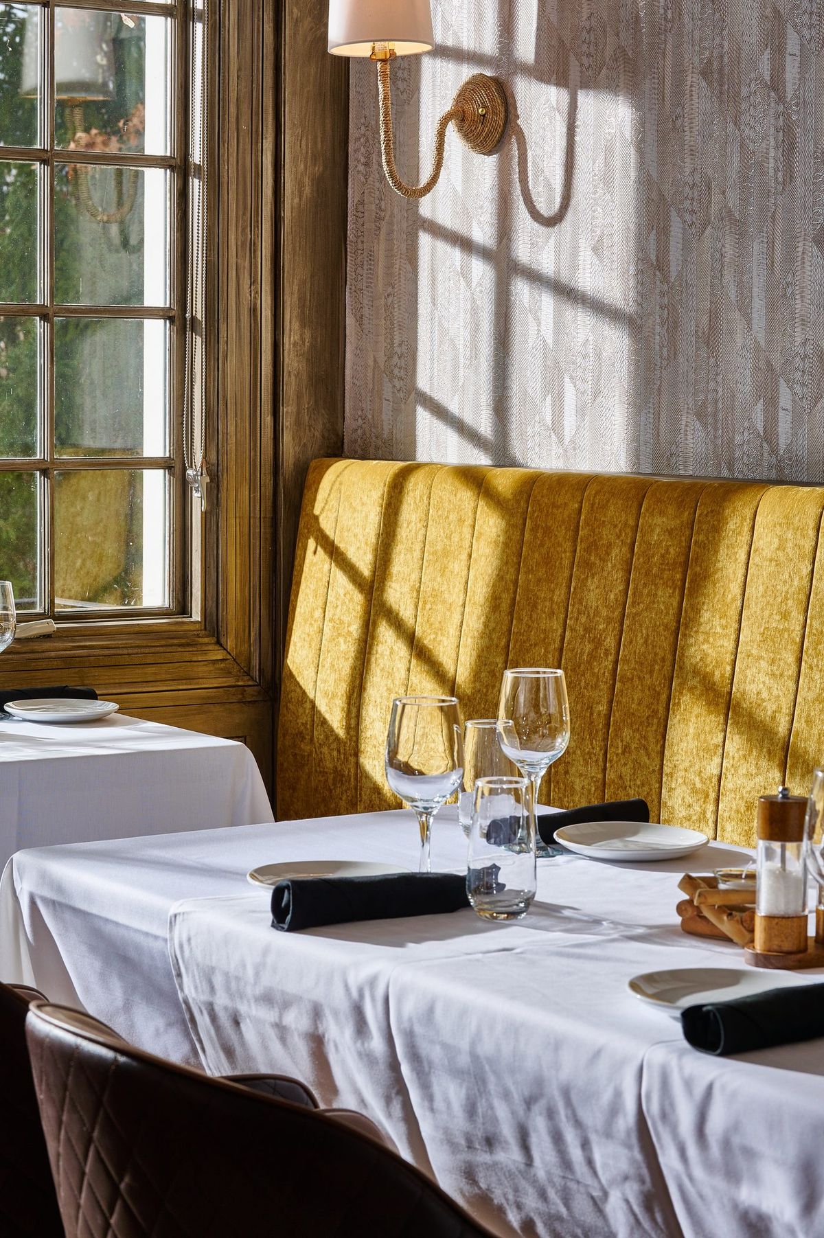
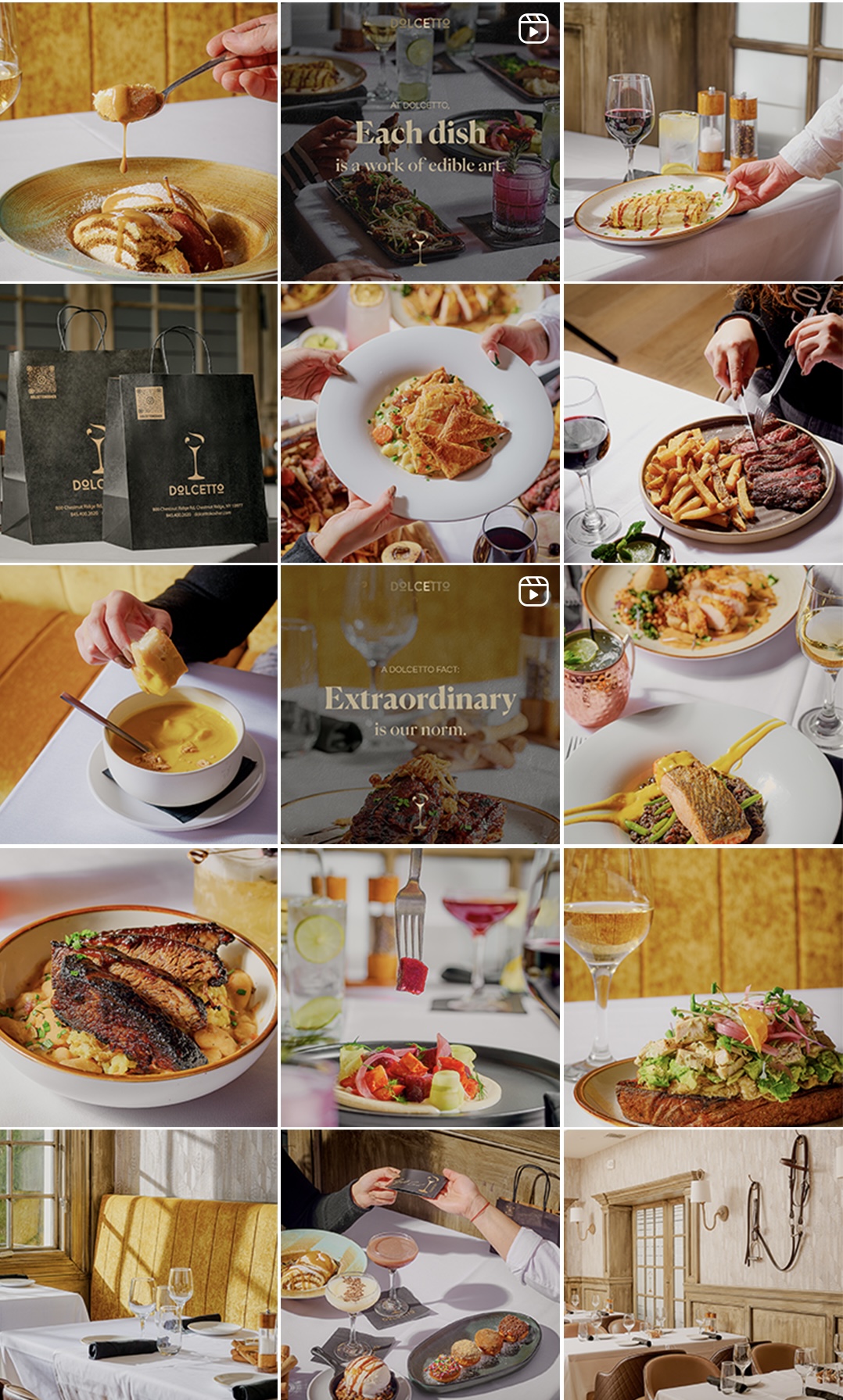
A rustic steakhouse in a market where every competitor was posting Canva templates and captions written by a chatbot. Standing out came down to deciding what the brand should look like before anything got made, which nobody in the category had done.
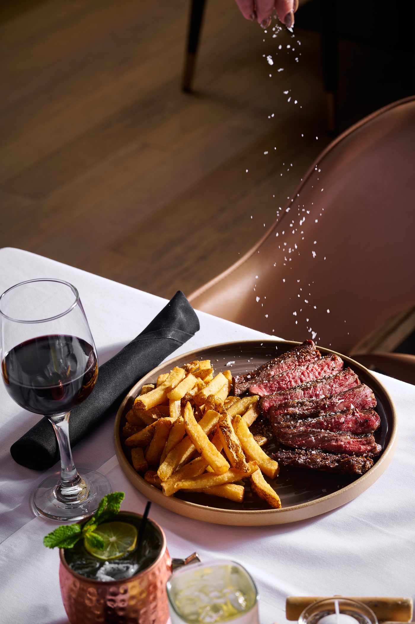
We built the voice, then the visual standard underneath it. High-end typography, a consistent editorial grid, and photography we directed rather than received. We sourced the photographer, led the shoots, and brought in videographers when the work called for it. Some days we shot it ourselves.
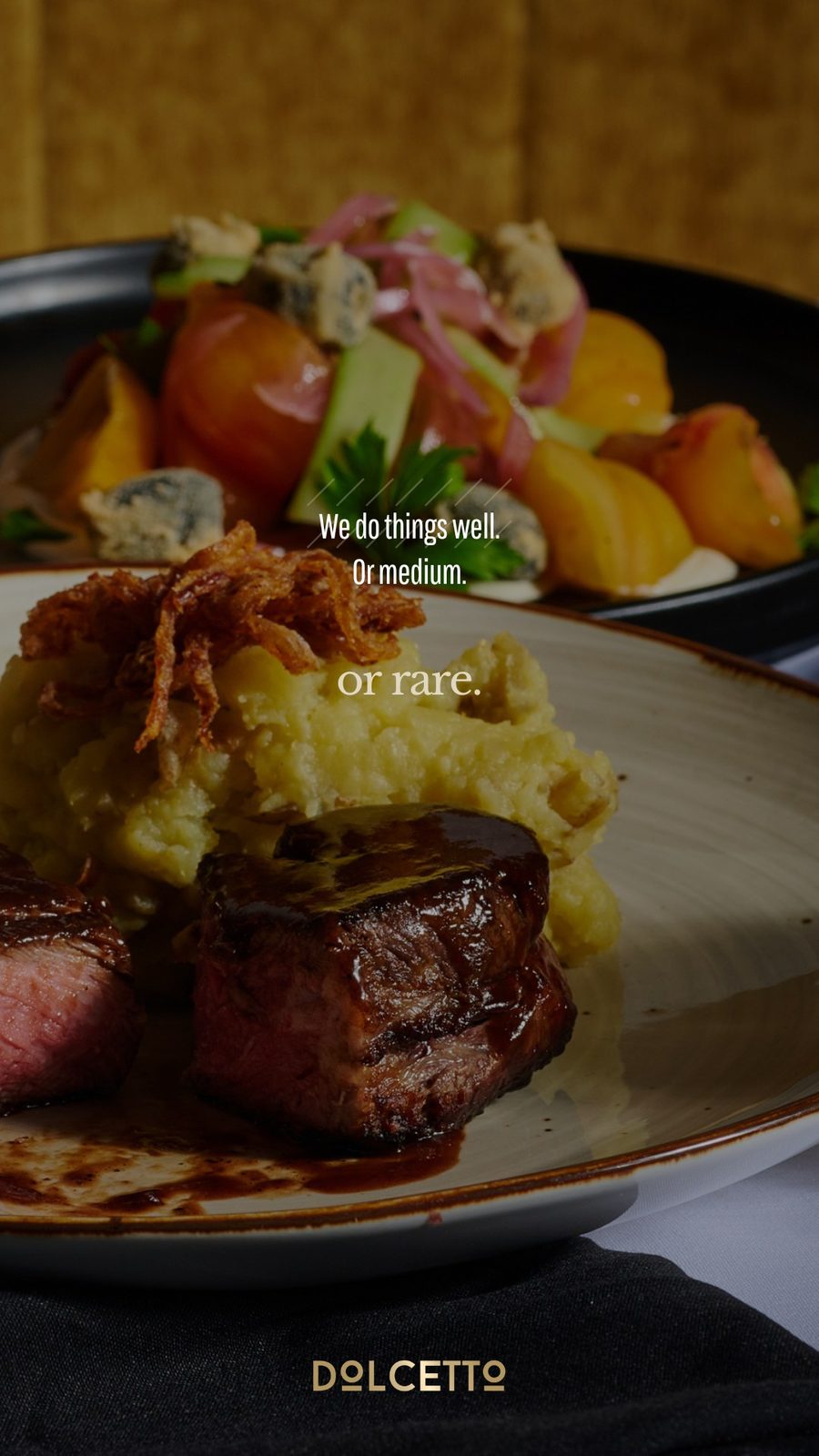
Every day their team sent a piece to their WhatsApp channel: a directed photograph of the room or a plate, with copy written to sound like the restaurant rather than a promotion, laid out so it could go straight out without anyone touching it. We do things well. Or medium. Or rare. That line went out on a steak, not in a brief.
Two years of it, held to the same standard on every story and every post. In a category where the bar was a template, consistency was the entire advantage.
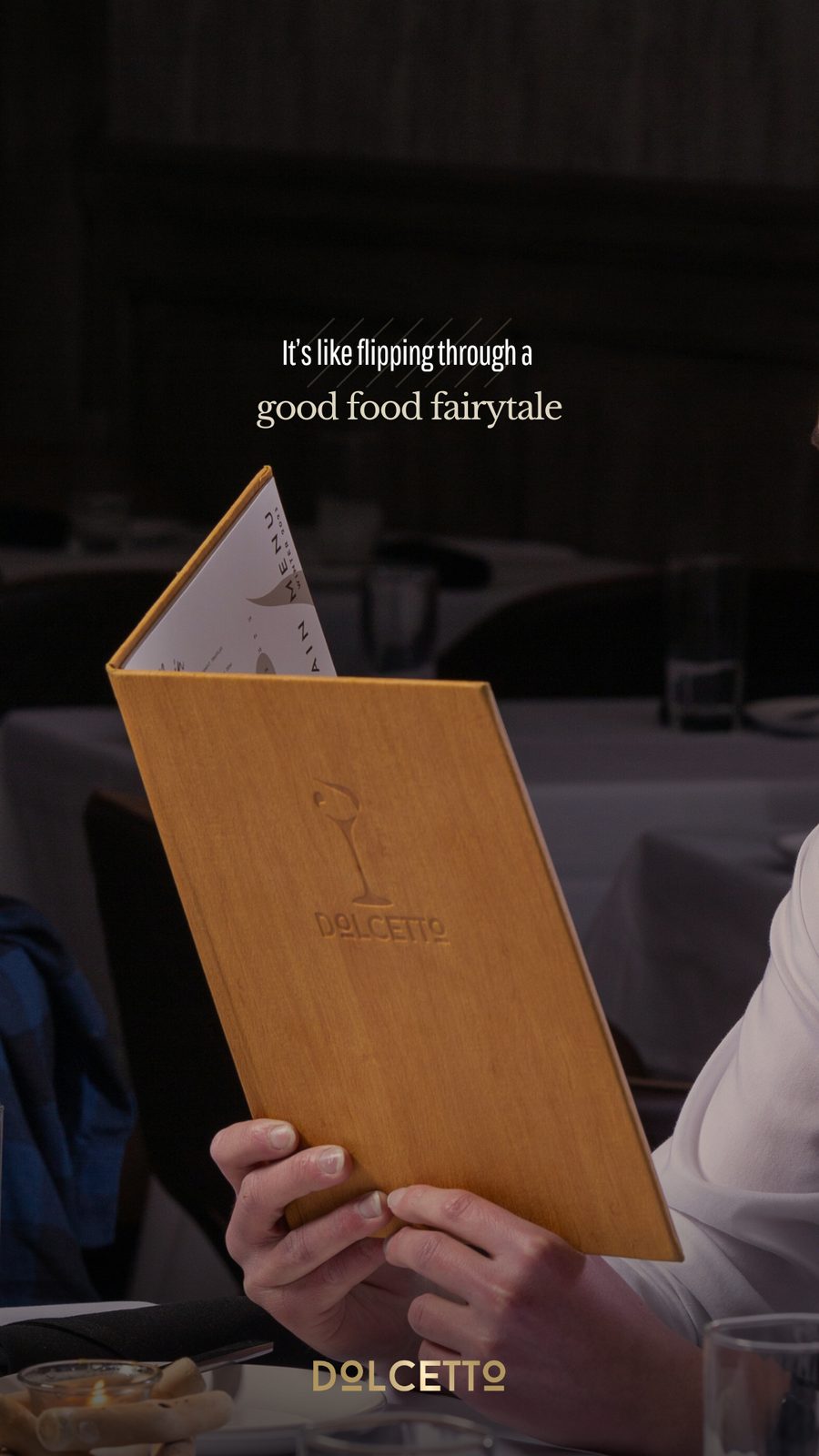
The menusDirected on setThe room
Daily pieces for stories and the WhatsApp channel. A looser register than the feed, on purpose.
The brand film, filmed and edited by the studio
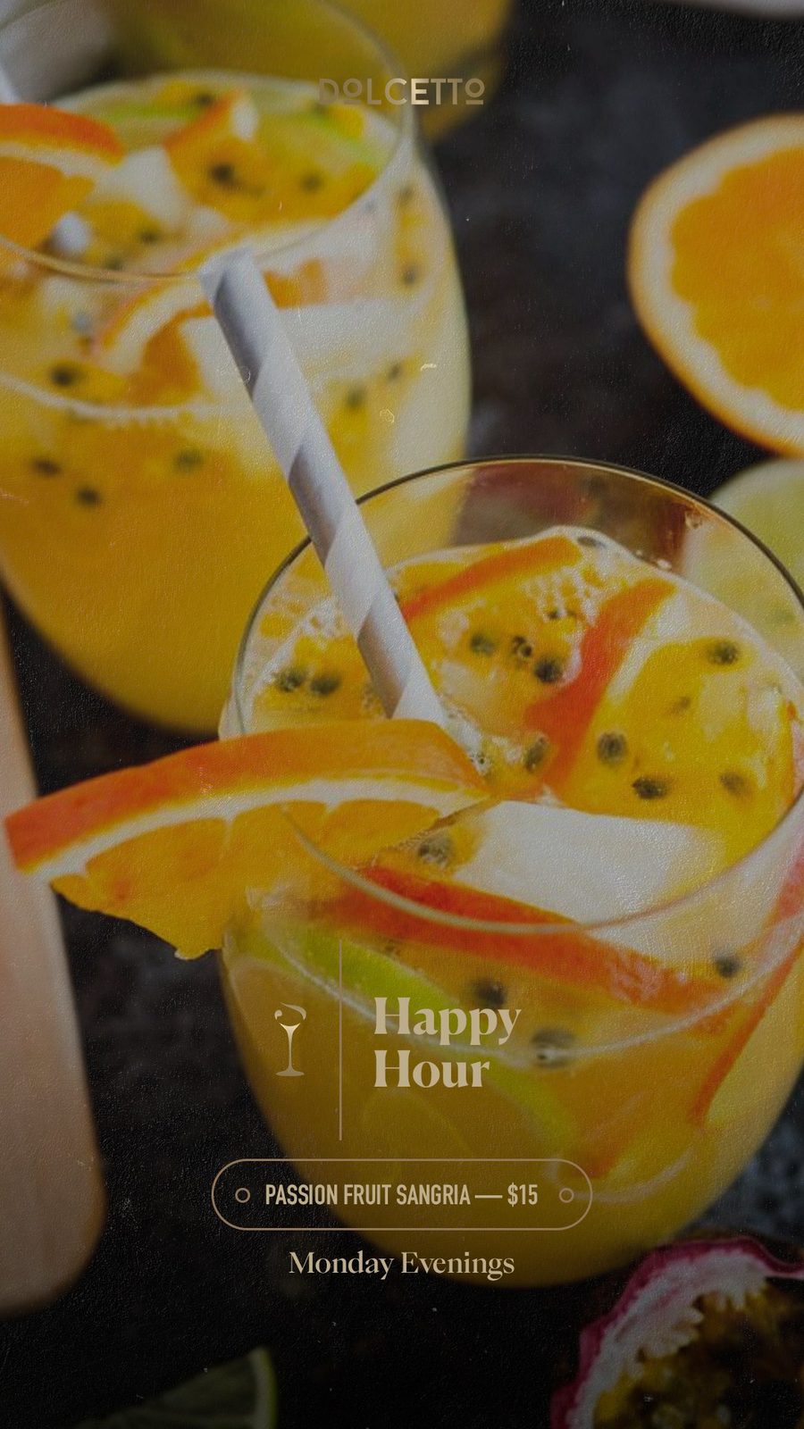
Daily pieceCopy, on the plateHappy hour series
2 YrsCreative direction
DailyBranded pieces
FullVoice, type & photography
The feed, held to one standard
A wig brand with twenty years behind it, in a market that had filled up underneath them. Dozens of newer labels arrived, most of them louder and built for a younger buyer, and Shevy went from setting the standard to competing for attention against names whose product could not match theirs.
The product had not changed. Still the best in the category, still made the same way. What had fallen behind was how the brand showed up. The media, the presence online, the language. Newer brands were winning on marketing rather than on quality, and the position Shevy had earned over twenty years was going undefended everywhere a customer could actually see it.
So we rebuilt the visual standard. A defined look the brand could hold to, unused footage cut into reels and carousels worth stopping on, and direction for the in-house team on what to shoot and how to frame it. Editorial, modern, and pitched at the level the name had already earned.
20 YrsLegacy name
VisualStandard rebuilt
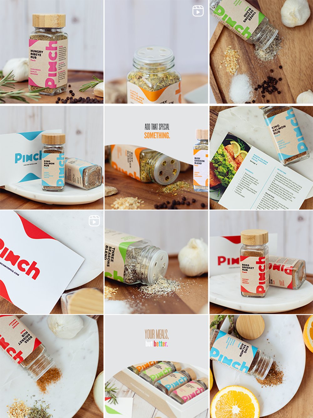
Pinch arrived with the branding already done. Bright, colourful, confident, with a first product shoot in hand. What they had no plan for was the part that comes after the packaging is finished: how a brand like that behaves on social, week after week.
The range speaks to two people at once. Seasoned cooks, which the founder is himself, and people who want dinner to come out well without having to be confident in a kitchen. The gift box ships with recipe cards for exactly that reason. So the strategy was to keep the product in frame and build a brand around it wide enough to hold both.
The biggest move was putting the founder on camera. In the kosher market trust travels through people, and he has been cooking professionally for years. When he speaks to camera about a dish he actually makes, the blends stop reading as a product on a shelf and start reading as something a chef you trust reaches for. We began collaborating with his own page alongside the brand's, so the two carried each other.
We shot the product again, then built a weekly rhythm of filmed recipes, properly lit and properly cut, putting the blends inside meals someone would actually make on a Tuesday.
Then we went further out. We sent product to a creator who builds miniature food and cooks with it, sound and all. She recreated the Pinch bottles in miniature, and the film reached close to 250,000 people. We had the bottle woven into a rug, sculpted in clay, and baked as cookies. None of that was about a recipe. All of it was about turning a spice brand into something people wanted to look at.
One comment underneath the miniature film read: someone on the marketing team knew what they were doing.
Pinch is now stocked in most kosher supermarkets across the New York area and beyond, and on Amazon.
Product, packaging and campaign lines, held to one standard
A luxury in-home diamond consultation service, high-end and deeply personal, posting trend-heavy reels with no reach and no clear voice. We rewrote the narrative entirely. The copywriting spoke directly to their ideal client, women who want the experience of fine jewelry without the pressure of a showroom.
We built an aspirational, visually rich feed, directed their photographer on the exact images and props the brand needed, and brought in influencers to carry the offer further. Copy and direction turned the page into something that finally matched the quality of the service.